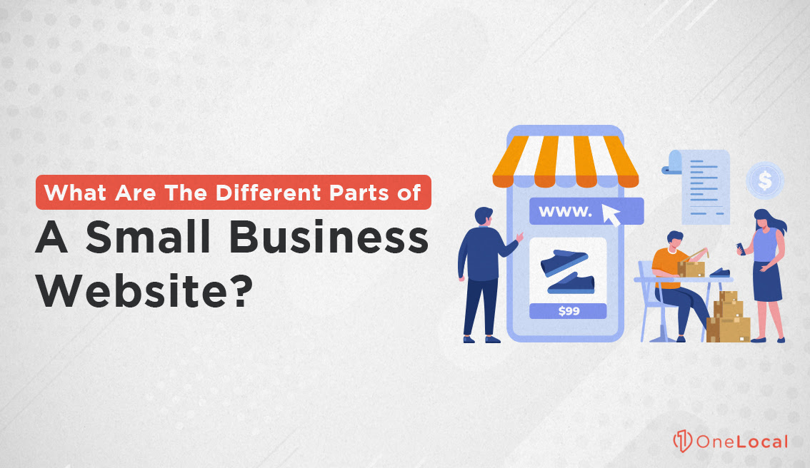
Your website has a few important parts that matter to its success online. Look at the homepage like it’s the first thing someone sees when they come to your place – it needs to show off what you offer right away. The “About Us” page is your chance to share your story and let people know what your business is in and what you want to accomplish.
I want to share the important parts of your small business website with you. These are the things that can make someone who visits just once want to come back again and again. You need to focus on these parts and make them better so your website keeps improving and does a good job for your visitors.
Let’s get started!
Build Your Header
I think a great website header should look simple and show off your brand well. Why not put your logo in the top left corner? That’s a clever idea because right away, everyone knows they’re at your site. If someone taps on your logo, it could send them back to the home page. Your header should match your brand’s look with your colors, font, and images that shout out, “This is me!”
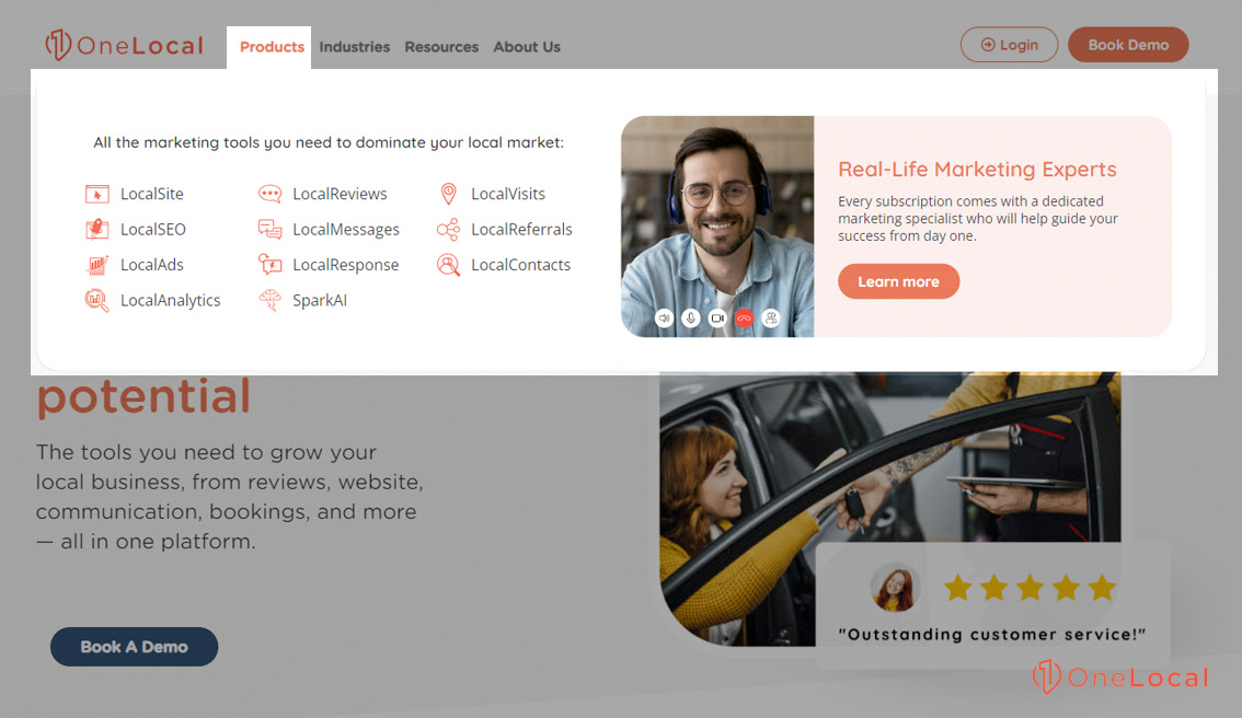
Keep your main menu easy to use. With lots of content, try to keep dropdown menus uncluttered. Remember to see how your header appears on mobiles as well. A simple menu icon (also known as a hamburger icon) can guide users without issue.
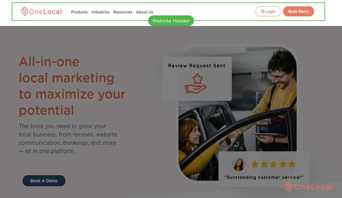
Let’s look at making your website easy to find. You hope search engines like Google will spot your site, don’t you? That means you need the correct schema and strong keywords right in your header. Also, double-check your header links – they can boost how well you do in search results.
Quick-action buttons in your header are a great idea, too, right? They push visitors to act, like buying what you sell or getting in touch. Make these buttons pop with a big size or strong color, especially to highlight a great deal.
And how about a big search box at the top? It helps people get to what they need quickly. A sticky header that stays put as you scroll makes sure your navigation is a tap away.
Design an Informative Footer
Make sure your website footer includes info that’s easy for people to find. Why not put your contact details up front? A phone number, email, and address work well. Link to your top pages like “About Me” and “Contact”. Remember social media icons – they’re super useful for a quick hop to your profiles.
Make your footer very easy to use for visitors. Organized links should guide them without a hitch. Have a ton of content? Slot in a search bar to help them spot what they’re after, pronto. Think about all your visitors – larger text and attractive colors will catch their attention!
Want people to stick around or become customers? Pop in a place for newsletter sign-ups with a clear, friendly invitation. Making feedback or getting in touch is a piece of cake; I’ve noticed this helps me know what my users are after.
Hoping to boost your website’s visibility online? A smart footer can contribute. Pepper in keywords that stand out, and keep your info up-to-date, like noting the current year. But remember, stuffing too many keywords can be a no-go.
Your brand’s personality should shine in your footer. Stick to your regular colors and fonts, and make sure it’s not too cluttered. Double-check that it looks good on both computers and mobiles.
In my view, take the time to plan your footer’s content. While I’ve shared some tips, they should match your brand’s tone. Too many things in your footer can turn people away, so pick what you add with care.
Tell Your Story on the About Us Page
Want to create an “About Us” page that attracts people’s attention? First, tell what your company does simply. What makes your business special? Have you won any awards? Keep it short.
Why should someone choose you? Talk about how you help your customers and that you care about more than making money. That’s huge! People notice that kind of thing when they’re choosing where to spend their money.
Put pictures and short videos of you and your team at work on your page. This lets people in on your world and helps them trust you. It shows why they should care about your products.
Spotlight your team! Share their stories and photos. This lets visitors see the real faces backstage. Put up customer praises and awards, too. This proves you’re legitimate.
Remember to ask visitors to do something! Invite them to check out your products, sign up for updates, or follow your social media. This is important!
Make sure people can find your page. Use simple words they might search for online and create a description that search engines love. And remember, your site has to be phone-friendly. That’s how most people surf the web now.
I think a good “About Us” page teaches and connects people to your brand at the same time. My advice? Keep it real, use your voice, and you’ll see more interest and trust. Your page shows what your company is in, so make it shine!
Services and Products
Think about what makes yours special. Is it your lightning-fast service or the way your product lasts longer than others? Put that in a big, strong headline to catch your eyes right away. Then, tell people how what you have solves their problems or spices up their lives!
Do you have great photos of what you’re selling? Use them! People love to see what they’re getting into. And throw in a CTA like “Buy now!” or “Free Demo” to get them moving.
Price tags should be clear as day – think about a side-by-side comparison if you have different choices. And yes, people dig reviews and star ratings, so add lots of those.
Lay out the details. Providing a service? Spell out each step, what you give, and what they’ll get. Clear up common concerns with a useful FAQ section, which helps people choose faster.
Your page should look sharper on phones, or you’ll lose people to that long load time. Keep those images snappy and your website running smoothly.
Contact Page
To make your small business website stand out, let people know how to contact you. This makes them trust you and start talking. Make your company name big and strong – it helps people remember you. A thorough address shows your business is legitimate and makes it easy for people to find you online. A big phone number means people can call you fast. Have different emails for each part of your business so people can choose how to reach out.
Why not have a simple form that people can fill out in no time? Or direct lines for each team, a chat feature, and links to social media to suit everyone’s taste?
Your contact info should be easy to find – no one likes to search high and low. It looks good on phones, too, which can make your site load faster and maybe even get you higher up on Google.
You can use something called schema markup to help Google know your contact info better. When you write your contact page and small descriptions for search engines, pick words that are easy to know and help you show up in searches.
Let people know their privacy matters with a link to your privacy policy. Trust grows when you show off client reviews or proof that you’re reliable. To save everyone’s time, put common questions and answers on your FAQ page.
A “Call us now” button can make people want to reach out. Tell them how long they’ll have to wait for a reply so they’re not left wondering. If you have a physical shop, put a map on your site to draw in the locals, and offer your details in various languages if you work with people from all over. Always keep your contact details and links fresh to show you’re on top of things.
I think a sharp, updated contact page makes people think better of your brand. Checking this page commonly to make sure it does its job is a smart move. My top tip is to make reaching out to your business easy.
Show Off Your Testimonials
Will you spruce up your customer testimonial page? I say go for it! Think about a grid or card layout – it’s a snap for people to skim through. Keep the design clean, and make sure it fits well on every device, phones in particular since their screen sizes vary a lot.
Spotlight your fantastic testimonials. How about making them bolder or setting them apart so they grab attention right away?
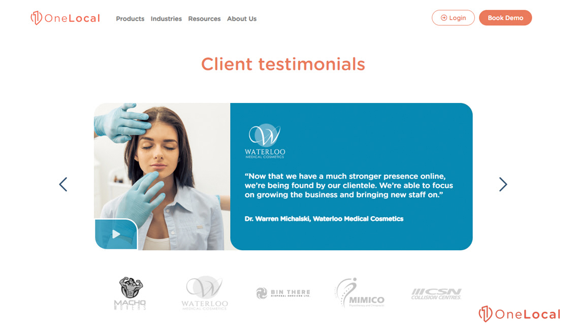
Real praise is way better than made-up flattery. A handful of honest feedback can showcase your credibility. Look to add perspectives from people across different jobs to show large support.
Add names, titles, and photos to your testimonials – it gives them a personal touch. Videos with customer stories are powerful – viewers can see and hear the real experiences. Keep your page current with new testimonials to signal your ongoing success.
Oh, and make sure people can find your testimonial page online. Choose plain, attractive words for your title and meta descriptions to lure in the right crowd. A dash of clever coding, like schema, might just improve your search engine rank. Also, linking back to your main page and product pages can do wonders for your SEO.
Remember to show your awards and partnerships. Display familiar logos and certificates prominently to underline your authenticity. If you can, give you a link to the source of the testimonial so people can check it out for real.
Portfolio or Case Studies
I commonly tell people, “You’ve got to show off your work on your website – it’s a must!” So, why not kick things off with a simple headline like “See Our Work”? Tell people right away what they’re going to see. Sort your work by the type of service, the kind of industry, or the results you have; this makes it easier for people to find what they’re looking for.
When you’re showcasing a project, make sure you guide visitors step by step through your process. Start with a snappy title that points out the big wins. Chat about the client, their business, and the hurdles they faced. Focus on the simple tools or methods you used to tackle those problems. Success can then be highlighted, like better sales or happier customers, with clear results.
Did you catch that photos and videos can really make your stories stand out? Pick ones that tie in well with your work and look amazing. Describe your images with simple text so everyone can understand and find your site. Add positive words from clients to build trust. Wrap up with a clear next step for your readers.
Make sure your portfolio matches your brand’s style, keeping it pro and consistent. It has to look good on phones, too – that’s a big deal for keeping visitors content and doing well on search engines.
Engage and Educate with a Blog
I always begin my business blog with definite goals and a good grasp of who my audience is. This will make sure my articles hit the mark and have a big change.
To keep things interesting, I mix my content. How can you keep a reader’s attention? Add several content – like eye-catching pictures and videos – to both articles. If something gets a lot of views, it means I’m doing something right with my SEO.
I stay sharp on SEO to make my blog stand out. I look for important phrases, boost my titles, write catchy summaries, and link my articles to each other. Remember, a lot of people use their phones to read, so I make sure my blog looks great on mobile devices.
I keep my blog looking neat, with text that’s easy to read and a design that keeps people around. A fast-loading blog shows I value my readers’ time.
What do I want my readers to do after reading? I tell them! Maybe it’s to subscribe or get in touch. Share buttons and a comment section help create a sense of community and spread the word even more.
Do you know how your blog’s really doing? Tools like Google Analytics are my help. They tell me what’s a hit and what’s a miss, helping me keep improving.
Wrapping Things Up
I think having a plain and helpful website for your small shop matters a lot. Look at it like your online welcome mat. Guests should be able to spot what they need fast. And who knows, it might just tempt them to buy something. The homepage matters. It says hello to people and points them in the right direction.
So, what about the “About Us” section? This spot tells everyone who you are and what you stand for. Here is where people start to trust you.
Now let’s chat about your store. If you sell things, post clear pictures and easy descriptions. Keep the buying steps super simple. If you deal in services, talk about them, show off good reviews, and put out your best work.
Keep your contact page simple, alright? Make it very easy for people to talk to you. Give them choices – a form, email, or phone number.
Think a blog or some helpful guides aren’t a big deal? You might want to think again! They prove you know your things, bump up your site in search results, and get more eyes on your page without costing a dime.
And those good words from happy buyers? Show them off! A little praise from customers can do wonders for how trustworthy you look.
Let’s hit on the footer. It might not seem like a big deal, but it really is. It’s where you tuck away your social media links, shop times, more navigation help, and the must-have legal things.
Go ahead and look at your site. Does it get the job done by helping customers go from just looking around to making a purchase? An impressive site does that and does it well. It’s put together with care to keep your customers’ needs in mind with every click.
From what I’ve seen, pouring a little soul into your website’s look can make it do a better job for your business.
Need a Better Small Business Website?
Do you want more people checking out your small business website and keep your regulars coming back for more? Let’s make sure your website is easy to use and looks great!
At OneLocal, we help small businesses dominate their online space. LocalSite is the specialized tool that we tailor to your web needs. With LocalReviews, you can easily handle customer feedback. Our LocalSEO service helps your website show up higher in search results, and LocalAds will make sure the right people see your ads.
Think of your website as the main center for your web business. We’re here to make it simpler for you to retain and attract new customers. OneLocal provides you with the tools and tips needed to improve your website’s performance for your business.
The competitive online world can seem difficult, but you have help – OneLocal can help you stand out. Book a demo with us soon! You’ll see firsthand how we help local businesses grow, keep customers returning, and increase sales. Make sure you take the opportunity to unleash your business’s full potential with OneLocal’s help.

Rachel Solway is a seasoned marketing professional dedicated to empowering small businesses through innovative marketing strategies. With extensive experience at OneLocal, a leading marketing solutions provider, Rachel’s insights are helping thousands of local businesses navigate the digital landscape.

